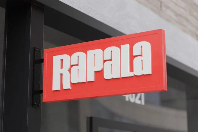
Two views of one storefront
A name mounted flat to the wall is usually considered from in front of the building. Someone walking close beside the windows can have a different view. Before comparing sign products, photograph both directions along the frontage and the view from across it. That helps establish whether the two approaches need separate identity pieces.
Keep the small face focused
A projecting sign often has less space for information. A recognizable name, mark, or concise combination can work more clearly than a full service list. The surrounding bracket and silhouette are part of the composition. Develop them with the graphic so the proposal looks like one physical object rather than artwork attached to an afterthought.
Connect rather than duplicate
A main wall identity and a projecting face do not need identical layouts. They can use related lettering, colors, and proportions while prioritizing different information. A window graphic may carry the details read close to the door. Assigning those roles keeps the entire frontage from repeating the same crowded message on every surface.
Bring the building into the decision
A projecting format depends on the property being able to accommodate it. Share the intended attachment surface, neighboring doors, canopies, and any landlord criteria. Mounting, clearance, and access are practical parts of the discussion. Start with the actual frontage and customer route; the product choice should follow from those facts.