SIGN SOLUTION
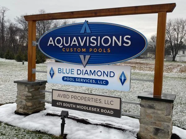
Monument signs
Make the property entrance feel like an arrival.
 A good sign.
Make channel lettering part of a coordinated sign plan for your Springfield, Tennessee property.
A few details give us a better starting point.
Your details are used to respond to this project. Privacy policy
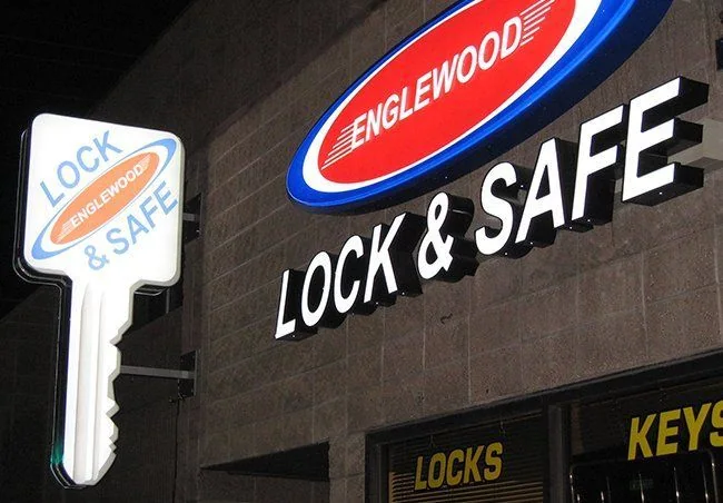
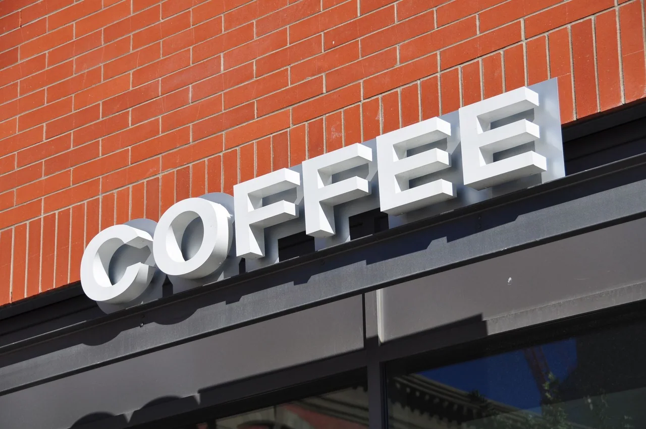
★★★★★5.014 customer reviewsGive the name shape, depth, and a considered lighting treatment. Individually fabricated letters can turn a flat identity into a focal point on the building or inside the business.
Letter depth, face finish, spacing, and illumination are interdependent choices. A face-lit treatment and a halo effect create different impressions, particularly against textured walls. Keep the logo’s proportions intact while adjusting the overall scale to the mounting area. Surrounding light is part of the view, so nighttime context matters as much as the artwork.
Springfield's courthouse square is part of its historic commercial identity. A business around that center is seen with neighboring elevations, while another property may be introduced from a longer vehicle approach. Choose the layout around the actual view rather than a city-wide assumption.
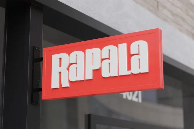
Separate the name from detailed information. A primary identity can stay concise, with a smaller entrance or directional message giving the next instruction. When replacing an older face, include the support or mounting area so a new graphic is discussed alongside its physical setting.
Send vector artwork if available, the proposed wall, approximate sign area, and a description of when visitors need to read the name.
Photograph the building as a whole, the intended mounting area, and any existing frame or bracket.